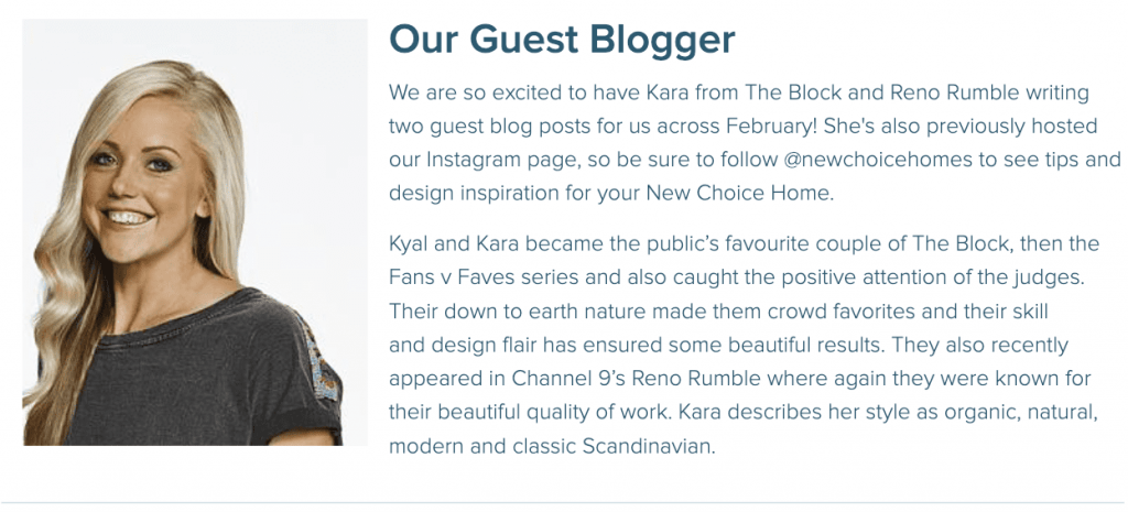
Kyal and Kara became the public’s favourite couple of The Block, then the Fans v Faves series and also caught the positive attention of the judges. Their down to earth nature made them crowd favourites and their skill and design flair has ensured some beautiful results. They also recently appeared in Channel 9’s Reno Rumble where again they were known for their beautiful quality of work. Kara describes her style as organic, natural, modern and classic Scandinavian and we can’t wait to see what tips and tricks she has to share with us!
Planning finishes for your home can be daunting to say the least! Unlike some of the internal finishes, exterior selections are generally going to be there for the long haul, and are more expensive to change. Don’t let that put you off though! It’s about choosing finishes that are true to what you love, with a few guidelines to help you along the way. It’s also a great idea to begin gathering your own inspiration. This may include starting a Pinterest board, collecting magazine clippings, and taking pictures of homes you’ve seen and love. At this stage, you should begin to see a theme developing as to what style or colour palette you’re leaning towards.
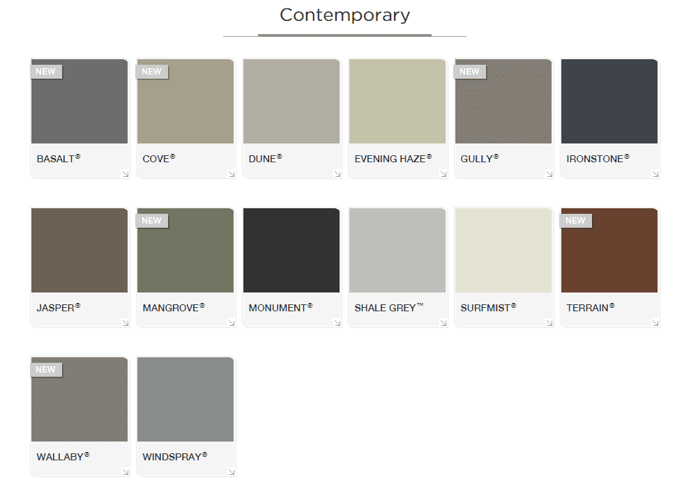
As a general rule, I always focus on the more permanent decisions first. In most cases, exteriorly, this is the roof colour. The Colorbond range has hues to suit every palette and choosing a colour will help guide further decisions along the way.
Once you’ve selected a roof colour that works, you need have a think about the body colour. Depending on the design of your home, you may also be working with a particular brick colour also. With this in mind, when selecting a paint colour for the walls, it’s best to think about colours in groups of three – let’s call this your “Master Palette”. This gives you the option to accentuate certain aspects of the fascade, creating interest and texture. An important point to consider, is that the paint colour will appear much lighter outdoors, especially in the sun. So don’t be afraid to go darker!
Depending on the look and feel you are hoping to achieve, you may want to think about incorporating a vibrant, contrasting colour that works with your chosen master palette. For those of you who love the idea of adding colour, this could be a bright front door, or for the more conservative, some bright pots.
I always like to obtain samples of every colour and material I am thinking of using. This may include a Colorbond roof sample, paint swatches, pavers, bricks, stone or even a picture of an outdoor chair you love. Grouping the samples together and creating your own ‘mood board’ is a great way to make sure you’re on the right track.
Here are a few colour palettes I’ve put together to give you some inspiration:
Light & Fresh Palette
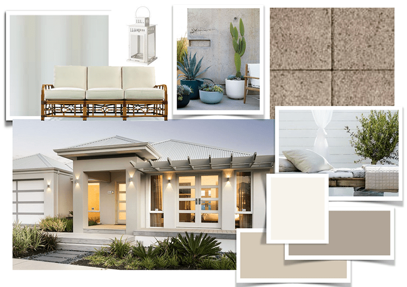
Featuring:
- Solver Paints ‘First Snow’ SE6-120/27-40D
- Solver Paints ‘Wallaby’ SF6-150/28-60D
- Solver Paints ‘Feather Dawn’ SE6-110/28-20B
- Colorbond ‘SurfMist
- Brikmakers Granite Collection ‘Sea Mist’
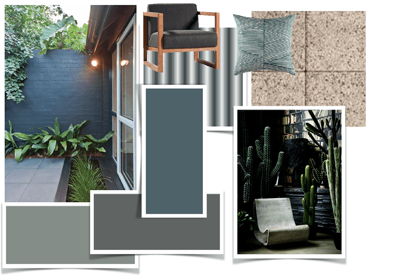
Sophisticated Contrast Palette
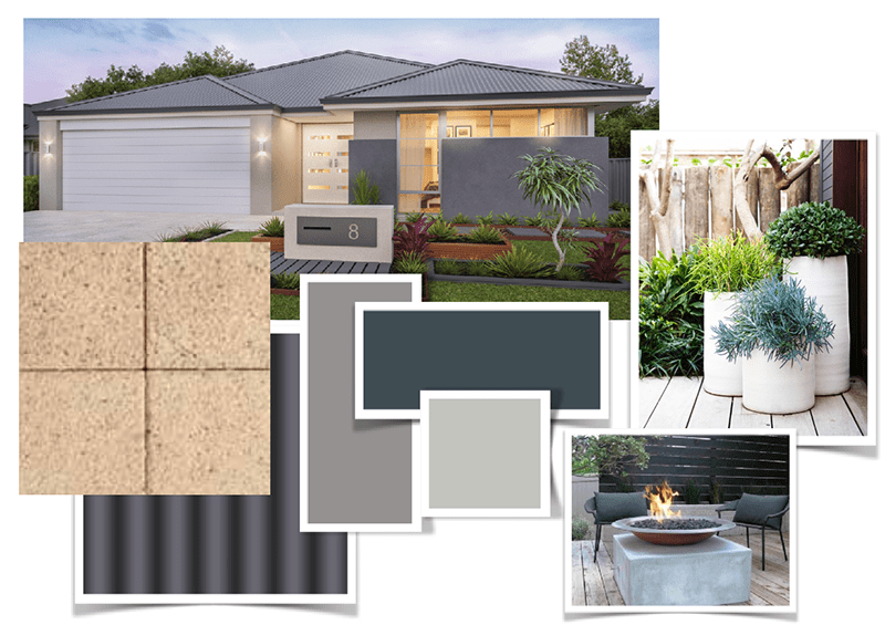
- Colobond ‘Monument®’
- Brikmakers Granite Collection ‘Arctic’
- Solver Paints ‘Mintaro Slate’ SE6-010/27-40A
- Solver Paints ‘Armor Plated’ SF6-170/28-40E
- Solver Paints ‘Grey Pearl’ SE6-070/27-30D
Warm & Inviting Palette
- Solver Paints ‘Kedron Blue’ SF1-020/27-40E
- Solver Paints ‘Fossil Creek’ SF6-020/27-50E
- Colorbond ‘Windspray®’
- Brikmakers Granite Collection ‘Tundra’
- Cabana Lounge Chair, Clickon Furniture
- 50x50cm Leife Cushion in Hunter Green, Freedom Furniture